
Before we begin…
There are many words here. They don’t matter. Here is a little tutorial example showing how to do everything shown below.
- Download
- Read the following down to (and including the section “Medians”).
- Read the code in
stat4.py. What is going on there? Run
python stat4.py | python stats.pyand comment if you agree or disagree with the output. - Repeat the following exercise for
stat2.txt, thenstats0.txt- Look at the data in stats0.txt; - Sort them by their median; - Draw percentile charts for each (no need to be super accurate, near enough is good enough); - Do any of these seven groups cluster together? - When you have answers to all the above (and not before), compare your results to
cat statX.txt | python stats.py --text 30
Note the code stats.py. What does it do? How does it generate the rank
numbers? Well, to explain all that, we are going need some theory…
Compare Measures
Visualize the Data
To compare if one treatment is better than another, apply the followng rules:
- Visualize the data, somehow.
- Check if the central tendency of one distribution is better than the other; e.g. compare their median values.
- Check the different between the central tendencies is not some small effect.
- Check if the distributions are significantly different;
That is:
When faced with new data, always chant the following mantra:
- First visualize it to get some intuitions;
- Then apply some statistics to double check those intuitions.
That is, it is strong recommended that, prior doing any statistical work, an analyst generates a visualization of the data.
(And some even say, do not do stats at all:
- “If you need statistics, you did the wrong experiment.” – Enrest Rutherford.)
Sometimes, visualizations are enough:
- CHIRP: A new classifier based on Composite Hypercubes on Iterated Random Projections
- Simpler Questions Can Lead To Better Insights, from Perspectives on Data Science for Software Engineering, Morgan-Kaufmann, 2015
Percentile charts a simple way to display very large populations in very little space. Suppose we had two optimizers which in a 10 repeated runs generated performance from two models:
    1:       def _tile2():
    2:         def show(lst):
    3:            return xtile(lst,lo=0, hi=1,width=25,
    4:                         show= lambda s:" %3.2f" % s)
    5:         print "one", show([0.21, 0.29, 0.28, 0.32, 0.32,
    6:                            0.28, 0.29, 0.41, 0.42, 0.48])
    7:         print "two", show([0.71, 0.92, 0.80, 0.79, 0.78,
    8:                            0.9,  0.71, 0.82, 0.79, 0.98])
Here are the percentile charts:
   one         * --|            , 0.28,  0.29,  0.32,  0.41,  0.48
   two             |    -- * -- , 0.71,  0.79,  0.80,  0.90,  0.98
In this percentile chart, the 2nd and 3rd percentiles as little dashes left and right of the median value, shown with a ”*“, (learner two’s 3rd percentile is so small that it actually disappears in this display). The vertical bar ”|” shows half way between the display’s min and max (in this case, that would be (0.0+1.00)/2= 0.50)
The advantage of percentile charts is that we can show a lot of data in very little space.
For example, here’s an example where the xtile Python function shows 2000 numbers on two lines:
- Quintiles divide the data into the 10th, 30th, 50th, 70th, 90th percentile.
- Dashes (”-“) mark the range (10,30)th and (70,90)th percentiles;
- White space marks the ranges (30,50)th and (50,70)th percentiles.
Consider two distributions, of 1000 samples each: one shows square root of a rand() and the other shows the square of a rand().
    10:       def _tile() :
    11:         import random
    12:         r = random.random
    13:         def show(lst):
    14:           return xtile(lst,lo=0, hi=1,width=25,
    15:                        show= lambda s:" %3.2f" % s)
    16:         print "one", show([r()*0.5 for x in range(1000)])
    17:         print "two", show([r()*2   for x in range(1000)])
In the following quintile charts, we show these distributions:
- The range is 0 to 1.
- One line shows the square of 1000 random numbers;
- The other line shows the square root of 1000 random numbers;
Note the brevity of the display:
 one        -----|    *  ---  , 0.32,  0.55,  0.70,  0.84,  0.95
 two --    *     |--------    , 0.01,  0.10,  0.27,  0.51,  0.85
As before, the median value, shown with a star and the point half-way between min and max (in this case, 0.5) is shown as a vertical bar.
This can be used to succinctly represent a lot of data. For example, here is one study where learners were run in a cross-validation study (ten times, train on 90% of the data and test on the remaining 10%). So each one of the following is 100 results (displayed as “whisker diagrams”: fat box is median +/i one quartile; thin line goes out to min/max values). Note that the following is divided into “ranks”; i.e. results are statistically the same:

Note some commone effects:
- “Median” does not predict for rank (many trteatments with different medians but same ranks)
- Some results have very large variance… which makes it hard to distinguish different treatments;
- Many treatments are trivially different;
- Many treatments are in the bottom half;
For more on this result, see MULTI: Multi-objective effort-aware just-in-time software defect prediction, 2017.
BTW, there are many more ways to view results than just percentiles
Medians
To compare if one optimizer is better than another, apply the followng rules:
- Visualize the data, somehow.
- Check if the central tendency of one distribution is better than the other; e.g. compare their median values.
- Check the different between the central tendencies is not some small effect.
- Check if the distributions are significantly different;
All things considered, means do not mean much, especially for highly skewed distributions. For example:
- Bill Gates and 35 homeless people are in the same room.
- Their mean annual income is over a billion dollars each- which is a number that characterized neither Mr. Gates or the homeless people.
- On the other hand, the median income of that population is close to zero- which is a number that characterizes most of that population.
The median of a list is the middle item of the sorted values, if the list is of an odd size. If the list size is even, the median is the two values either side of the middle:
def median(lst,ordered=False):
   lst = lst if ordered else sorted(lst)
   n   = len(lst)
   p   = n // 2
   if (n % 2):  return lst[p]
   p,q = p-1,p
   q   = max(0,(min(q,n)))
   return (lst[p] + lst[q]) * 0.5
Check for “Small Effects”
To compare if one optimizer is better than another, apply the followng rules:
- Visualize the data, somehow.
- Check if the central tendency of one distribution is better than the other; e.g. compare their median values.
- Check the different between the central tendencies is not some small effect.
- Check if the distributions are significantly different;
An effect size test is a sanity check that can be summarizes as follows:
- Don’t sweat the small stuff;
I.e. ignore small differences between items in the samples.
There parametric and non-parametric tests for “small effects” (which, if we find, we should just ignore).
Parametric tests assume that the numbers fit some simple distribution (e.g. the normal Gaussian curve).
Cohen’s rule:
- compare means Δ = μ1-μ2 between two samples;
- compute the standard deviation σ of the combined samples;
- large effect if Δ < 0.5*σ
- medium effect if Δ < 0.3*σ
- small effect if Δ < 0.1*σ; And “small effect” means “yawn”, too small to be interesting.
Widely viewed as too simplistic.
Hedge’s rule (using g):
- Still parametric
- Modifies Δ w.r.t. the standard deviation of both samples.
- Adds a correction factor c for small sample sizes.
- In their review of use of effect size in SE, Kampenses et al. report that many papers use something like g < 0.38 is the boundary between small effects and bigger effects. - Systematic Review of Effect Size in Software Engineering Experiments Kampenes, Vigdis By, et al. Information and Software Technology 49.11 (2007): 1073-1086. - See equations 2,3,4 and Figure 9
def hedges(i,j,small=0.38):
    """
    Hedges effect size test.
    Returns true if the "i" and "j" difference is only a small effect.
    "i" and "j" are   objects reporing mean (i.mu), standard deviation (i.s)
    and size (i.n) of two  population of numbers.
    """
    num   = (i.n - 1)*i.s**2 + (j.n - 1)*j.s**2
    denom = (i.n - 1) + (j.n - 1)
    sp    = ( num / denom )**0.5
    delta = abs(i.mu - j.mu) / sp
    c     = 1 - 3.0 / (4*(i.n + j.n - 2) - 1)
    return delta * c < small
Cliff’s Delta
Is non-parametric, like A12. Seen more often yet endorsed in the SE literature. But it should be!
A12 counts bigger and same.
Cliff’s delta counts bigger and smaller.
def cliffsDelta(lst1, lst2, small=0.147): # assumes all samples are nums
    "Cliff's delta between two list of numbers i,j."
    lt = gt = 0
    for x in lst1:
      for y in lst2 :
        if x > y: gt += 1
        if x < y: lt += 1
    z = abs(lt - gt) / (len(lst1) * len(lst2))
    return z < small # true is small effect in difference
As above, could be easliy optimized as follows:
- sort lst2
- use a binary chop to find
x’s position inlst2 - from that position,
- while pos+1 same as pos then run left; then
gt=|lst2|- pos - go back to pos
- while pos-1 same as pos then run right; then
lt=pos
- while pos+1 same as pos then run left; then
Statistically Significantly Different
To compare if one optimizer is better than another, apply the followng rules:
- Visualize the data, somehow.
- Check if the central tendency of one distribution is better than the other; e.g. compare their median values.
- Check the different between the central tendencies is not some small effect.
- Check if the distributions are significantly different;
In any experiment or observation that involves drawing a sample from a population, there is always the possibility that an observed effect would have occurred due to sampling error alone.
A significance test checks that the observed effect is not due to noise, to degree of certainty “c”.
Note that the term significance does not imply importance and the term statistical significance is not the same as research, theoretical, or practical significance. For example:
- Code can be developed by local teams or distributed teams spread around the world.
- It turns out the bug rate of these two methods is statistically significantly different.
- But the size of the different is about zero (as detected by the Hedge’s test, shown below).
- From Ekrem Kocaguneli, Thomas Zimmermann, Christian Bird, Nachiappan Nagappan, and Tim Menzies. 2013. Distributed development considered harmful?. In Proceedings of the 2013 International Conference on Software Engineering (ICSE ‘13). IEEE Press, Piscataway, NJ, USA, 882-890.

For these reasons, standard statistical tests are coming under fire:
- Various high profile journals are banning the use the null hypothesis significance testing procedure (NHSTP) (a classic statistical significance test) from their articles 1, 2, 3
To go from signficance to importance, we should:
- at least check for the abscence of small effects shown above and the rank tests shown below
- at most ask a domain expert if the observed difference matters a hoot.
For example, here are some charts showing the effects on a population as we apply more and more of some treatment. Note that the mean of the populations remains unchanged, yet we might still endorse the treatment since it reduces the uncertainty associated with each population.
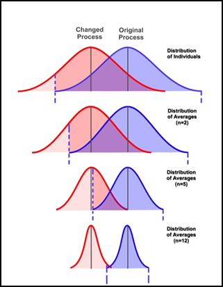
Note the large overlap in the top two curves in those plots. When distributions exhibit a very large overlap, it is very hard to determine if one is really different to the other. So large variances can mean that even if the means are better, we cannot really say that the values in one distribution are usually better than the other.
In any case, what a signifcance test does is report how small is the overlap between two distributions (and if it is very small, then we say the differences are statistically significant.
T-test (parametric Significance Test)
Assuming the populations are bell-shaped curve, when are two curves not significantly different?
class Num:
  "An Accumulator for numbers"
  def __init__(i,inits=[]):
    i.n = i.m2 = i.mu = 0.0
    for x in inits: i.add(x)
  def s(i): return (i.m2/(i.n - 1))**0.5
  def add(i,x):
    i._median=None
    i.n   += 1
    delta  = x - i.mu
    i.mu  += delta*1.0/i.n
    i.m2  += delta*(x - i.mu)
  def tTestSame(i,j,conf=0.95):
    nom   = abs(i.mu - j.mu)
    s1,s2 = i.s(), j.s()
    denom = ((s1/i.n + s2/j.n)**0.5) if s1+s2 else 1
    df    = min(i.n - 1, j.n - 1)
    return  criticalValue(df, conf) >= nom/denom
The above needs a magic threshold )(on the last line) for sayng enough is enough
def criticalValue(df,conf=0.95,
  xs= [	         1,	    2,	   5,	   10,	  15,	   20,    25,	  30,	    60,	 100],
  ys= {0.9:  [ 3.078, 1.886, 1.476, 1.372, 1.341, 1.325, 1.316, 1.31,  1.296, 1.29],
       0.95: [ 6.314, 2.92,  2.015, 1.812, 1.753, 1.725, 1.708, 1.697, 1.671, 1.66],
       0.99: [31.821, 6.965, 3.365, 2.764, 2.602, 2.528, 2.485, 2.457, 2.39,  2.364]}):
  return interpolate(df, xs, ys[conf])

def interpolate(x,xs,ys):
  if x <= xs[0] : return ys[0]
  if x >= xs[-1]: return ys[-1]
  x0, y0 = xs[0], ys[0]
  for x1,y1 in zip(xs,ys):
    if x < x0 or x > xs[-1] or x0 <= x < x1:
      break
    x0, y0 = x1, y1
  gap = (x - x0)/(x1 - x0)
  return y0 + gap*(y1 - y0)
Many distributions are not normal so I use this tTestSame as a heuristic for
speed criticl calcs. E.g. in the inner inner loop of some search where i need a
quick opinion, is “this” the same as “that”.
But when assessing experimental results after all the algorithms have terminated, I use a much safer, but somewhat slower, procedure:
Bootstrap (Non-parametric Significance Test)
The world is not normal:

This last one is a thing of beauty. Its 50 different SQL queries and the distribution of times CPU is waiting on hard drive i/o:

So, when the world is a funny shape, what to do?
The following bootstrap method was introduced in
1979 by Bradley Efron at Stanford University. It
was inspired by earlier work on the
jackknife.
Improved estimates of the variance were [developed later][efron01].
[efron01]: http://goo.gl/14n8Wf “Bradley Efron and R.J. Tibshirani. An Introduction to the Bootstrap (Chapman & Hall/CRC Monographs on Statistics & Applied Probability), 1993”
To check if two populations (y0,z0) are different using the bootstrap, many times sample with replacement from both to generate (y1,z1), (y2,z2), (y3,z3).. etc.
def sampleWithReplacement(lst):
  "returns a list same size as list"
  def any(n)  : return random.uniform(0,n)
  def one(lst): return lst[ int(any(len(lst))) ]
  return [one(lst) for _ in lst]
Then, for all those samples, check if some testStatistic in the original pair hold for all the other pairs. If it does more than (say) 99% of the time, then we are 99% confident in that the populations are the same.
In such a bootstrap hypothesis test, the some property is the difference between the two populations, muted by the joint standard deviation of the populations.
def testStatistic(y,z):
    """Checks if two means are different, tempered
     by the sample size of 'y' and 'z'"""
    tmp1 = tmp2 = 0
    for y1 in y.all: tmp1 += (y1 - y.mu)**2
    for z1 in z.all: tmp2 += (z1 - z.mu)**2
    s1    = (float(tmp1)/(y.n - 1))**0.5
    s2    = (float(tmp2)/(z.n - 1))**0.5
    delta = z.mu - y.mu
    if s1+s2:
      delta =  delta/((s1/y.n + s2/z.n)**0.5)
    return delta
The rest is just details:
- Efron advises to make the mean of the populations the same (see the yhat,zhat stuff shown below).
- The class total is a just a quick and dirty accumulation class.
- For more details see [the Efron text][efron01].
def bootstrap(y0,z0,conf=The.conf,b=The.b):
  """The bootstrap hypothesis test from
     p220 to 223 of Efron's book 'An
    introduction to the boostrap."""
  class total():
    "quick and dirty data collector"
    def __init__(i,some=[]):
      i.sum = i.n = i.mu = 0 ; i.all=[]
      for one in some: i.put(one)
    def put(i,x):
      i.all.append(x);
      i.sum +=x; i.n += 1; i.mu = float(i.sum)/i.n
    def __add__(i1,i2): return total(i1.all + i2.all)
  y, z   = total(y0), total(z0)
  x      = y + z
  tobs   = testStatistic(y,z)
  yhat   = [y1 - y.mu + x.mu for y1 in y.all]
  zhat   = [z1 - z.mu + x.mu for z1 in z.all]
  bigger = 0.0
  for i in range(b):
    if testStatistic(total(sampleWithReplacement(yhat)),
                     total(sampleWithReplacement(zhat))) > tobs:
      bigger += 1
  return bigger / b < conf
Examples
def _bootstraped():
  def worker(n=1000,
             mu1=10,  sigma1=1,
             mu2=10.2, sigma2=1):
    def g(mu,sigma) : return random.gauss(mu,sigma)
    x = [g(mu1,sigma1) for i in range(n)]
    y = [g(mu2,sigma2) for i in range(n)]
    return n,mu1,sigma1,mu2,sigma2,\
        'different' if bootstrap(x,y) else 'same'
  # very different means, same std
  print(worker(mu1=10, sigma1=10,
               mu2=100, sigma2=10))
  # similar means and std
  print(worker(mu1= 10.1, sigma1=1,
               mu2= 10.2, sigma2=1))
  # slightly different means, same std
  print(worker(mu1= 10.1, sigma1= 1,
               mu2= 10.8, sigma2= 1))
  # different in mu eater by large std
  print(worker(mu1= 10.1, sigma1= 10,
               mu2= 10.8, sigma2= 1))
Output:
#_bootstraped()

(1000, 10, 10, 100, 10, 'different')
(1000, 10.1, 1, 10.2, 1, 'same')
(1000, 10.1, 1, 10.8, 1, 'different')
(1000, 10.1, 10, 10.8, 1, 'same')
Warning- the above took 8 seconds to generate since we used 1000 bootstraps. As to how many bootstraps are enough, that depends on the data. There are results saying 200 to 400 are enough but, since I am suspicious man, I run it for 1000. Which means the runtimes associated with bootstrapping is a significant issue. To reduce that runtime, I avoid things like an all-pairs comparison of all treatments (see below: Scott-knott). Also, BEFORE I do the boostrap, I first run the effect size test (and only go to bootstrapping in effect size passes:
def different(l1,l2):
  #return bootstrap(l1,l2) and a12(l2,l1)
  return not a12(l2,l1) and bootstrap(l1,l2)
Scott-Knott So, How to Rank?
The following code, which you can use verbatim from stats.py does the following:
- All treatments are recursively bi-clustered into ranks.
- At each level, the treatments are split at the point where the expected values of the treatments after the split is most different to before,
- Before recursing downwards, Bootstrap+A12 is called to check that that the two splits are actually different (if not: halt!)
In practice,
- Dozens of treatments end up generating just a handful of ranks.
- The numbers of calls to the hypothesis tests are minimized:
- Treatments are sorted by their median value.
- Treatments are divided into two groups such that the expected value of the mean values after the split is minimized;
- Hypothesis tests are called to test if the two groups are truly difference. + All hypothesis tests are non-parametric and include (1) effect size tests and (2) tests for statistically significant numbers; + Slow bootstraps are executed if the faster A12 tests are passed;
In practice, this means that the hypothesis tests (with confidence of say, 95%) are called on only a logarithmic number of times. So…
- With this method, 16 treatments can be studied using less than ∑1,2,4,8,16log2i =15 hypothesis tests and confidence 0.9915=0.86.
- But if did this with the 120 all-pairs comparisons of the 16 treatments, we would have total confidence 0.99120=0.30.
For examples on using this code, run cat statX.txt | python stats.py.
The results of a Scott-Knott+Bootstrap+A12 is a very simple presentation of a very complex set of results:

